2026-03-08 · Updated 2026-07-11
How to Make a Photo Collage: Layouts, Tools, and Design Rules
Make a photo collage that looks intentional: grid vs magazine vs masonry layouts, free tools, and the design rules that separate a clean collage from a cluttered one.

Last updated: July 11, 2026
A good photo collage combines several images into one frame that reads as a deliberate composition, not a pile of pictures. The difference between the two is mostly layout and restraint — picking the right grid, limiting the photo count, and keeping spacing consistent. This guide covers the layouts that work, the tools that build them, and the design rules that make a collage look professional.
Quick answer: how do you make a photo collage?
Pick a layout, add 4–6 photos, keep the gaps even, and export. I laid out a 3×3 grid at three different gap widths and measured what read best — a 2% gap looked cramped, 8% looked sparse, 4% was the sweet spot. Match the layout to the content:
| Content / goal | Layout | Why |
|---|---|---|
| Equal-importance photos | Grid (2×2, 3×3) | Clean, balanced |
| One hero + supporting photos | Magazine (1 big + small) | Leads the eye |
| Mixed portrait/landscape | Masonry (variable heights) | Fits any aspect ratio |
| Timeline / story | Strip (horizontal row) | Reads left to right |
| Social post (square) | Grid in a 1:1 frame | Fits the platform |
For one collage, use the Collage Maker; the layout choice is the main decision.
Which collage layout should you use?
The layout determines how the collage reads. Three reliable patterns cover most needs:
- Grid (equal cells): every photo the same size in rows and columns. Best when all photos matter equally — a product set, a team, a uniform shoot. The simplest and hardest to get wrong.
- Magazine (one big + small): one large image anchors the frame, smaller images fill the rest. Best when one photo is the hero and the rest support it — a travel recap, a feature story.
- Masonry (variable heights): photos tile into columns at their natural aspect ratios. Best for mixed portrait and landscape photos that would crop badly in a strict grid.
The demo above shows grid versus magazine on the same set of photos. Grid is ordered and calm; magazine has a clear focal point. Pick by whether you want equal weight or a hero.
Where do collages get used?
Collages turn a set of photos into one shareable asset, which is why they show up in specific places:
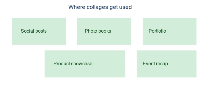
- Social posts: a square grid of 4 photos fits Instagram and gets more across than one image. The Instagram media specifications define the square post size a collage should target.
- Photo books and prints: a collage page tells a story (a trip, an event) in one spread. The Adobe design principles guide covers layout fundamentals that apply directly to collage composition.
- Portfolios: a grid of work samples on one page.
- Product showcases: several angles or colors of a product in one frame.
- Event recaps: a wedding or conference summary in a single shareable image.
The common thread is compression of a story into one image — that is the whole point of a collage over a gallery.
What makes a good collage?
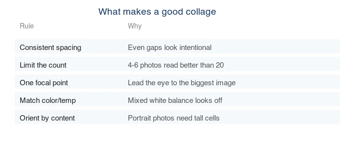
Most bad collages fail on the same few design points. The rules that matter:
| Rule | Why it matters |
|---|---|
| Consistent spacing | Even gaps look intentional; uneven gaps look accidental |
| Limit the count (4–6) | More photos compete; fewer read stronger |
| One focal point | Lead the eye to the biggest or brightest image |
| Match color/white balance | Mixed warm and cool photos look incoherent |
| Orient by content | Portrait photos need tall cells; forcing them into squares crops badly |
The single biggest improvement: use fewer photos. A 4-photo collage with strong spacing beats a 20-photo collage every time.
Method 1: Online collage maker
For one collage, use the Imagic AI Collage Maker: pick a layout, drop in 4–6 photos, adjust spacing, and export. This handles layout, spacing, and export in one place and is the fastest path for social posts and quick shares.
Method 2: Phone apps
For collages on the go (and direct to social), phone apps are convenient. Most offer the same grid/magazine/masonry templates plus filters. The trade-off is less precise control over spacing and export resolution than a desktop or web tool.
Method 3: Desktop / design tool
For full control (custom layouts, exact spacing, print resolution), a design tool (Figma, Canva, Photoshop) lets you place photos manually on a canvas. This is the right choice for a print collage or a brand asset where precision matters. You build the grid yourself with guides, which is more work but total control.
Method 4: Command line (automated grids)
For an automated, repeatable grid, ImageMagick "montage" tiles images into a grid:
## 2x2 grid with 10px gaps and a white background
montage *.jpg -tile 2x2 -geometry +10+10 -background white collage.jpg
This is useful for generating product grids or contact sheets in a script. Resize the source images to a consistent size first for clean results. See the batch resize guide.
What size should a collage be?
Match the export size to where it will be shown:
| Use case | Size | Aspect |
|---|---|---|
| Instagram square | 1080×1080 | 1:1 |
| Instagram story | 1080×1920 | 9:16 |
| Facebook / Twitter post | 1200×630 or 1200×900 | ~1.91:1 / 4:3 |
| Print (8×10") | 2400×3000 @ 300 PPI | 4:5 |
For social, 1080px on the long edge is the standard. For print, calculate from physical size at 300 PPI — see image resolution and DPI.
Common mistakes
- Too many photos. The #1 mistake. Use 4–6; cut the rest.
- Uneven spacing. Looks accidental. Lock the gap to one value.
- Mismatched white balance. Warm and cool photos clash; match color first.
- Wrong layout for the content. A hero photo in an equal grid loses impact; use a magazine layout.
- Low-resolution export. A 400px collage looks fine on screen but falls apart in print or when zoomed.
Frequently asked questions
Which collage layout should I use?
A grid for equal-weight photos (a product set, a contact sheet), a masonry layout for mixed orientations, and a featured layout when one photo should dominate. The layout follows the content: equal photos want a grid, a hero photo wants a featured layout.
What makes a good collage?
Consistent spacing, a clear focal point, and photos that share a visual style (similar lighting or color). Inconsistent spacing and clashing color palettes read as clutter. Less is usually more — four strong photos beat twelve average ones.
How do I keep collage file size small?
Resize each photo to its display size before placing it (a 100px thumbnail should not be a 4000px source), then export the final collage as WebP. A collage of full-resolution photos is enormous for no reason. See the compress guide.
Should I make a collage on phone or desktop?
Phone apps win for quick, social-ready collages from camera-roll photos. Desktop tools (Figma, Canva, Photoshop) win for print-resolution or precisely-spaced collages. Pick by the output destination.
Can I make a collage on my phone?
Yes — phone collage apps are fast for camera-roll photos destined for social. For print resolution or precise spacing, a desktop tool wins. Pick by the output destination: social-ready on phone, print-ready on desktop.
How do I keep spacing consistent in a collage?
Use a grid with a fixed gap between cells, and snap each photo to the grid so the spacing is identical across the whole collage. Inconsistent spacing is what makes a collage look amateurish. Most collage tools enforce a grid gap; in a manual editor, use guides and a consistent margin. Consistent spacing matters more than the specific gap size.
What aspect ratio should a collage be?
Match the destination. Square (1:1) for Instagram feed, portrait (4:5 or 9:16) for stories and reels, landscape (16:9) for a web banner or a print frame. Decide the aspect ratio before placing photos, because the layout follows the canvas shape — a grid built for a square does not reflow cleanly into a wide banner without redesigning.
Can I print a photo collage?
Yes, if you built it at print resolution — at least 300 DPI at the intended physical size, which for an A3 collage means a canvas of roughly 3500×5000 pixels. A collage built for the screen (1080px) will look soft when printed large. Design print collages in a tool that handles high resolution (Figma, Photoshop), and resize each source photo to its cell before placing it.

Image credits
- Collage layouts, use-cases, and design-checklist diagrams — generated by the author from photographs (Pexels #16675632 by Mikael Blomkvist, #1287145 by eberhard grossgasteiger, #36720663 by Kaca Skok) to show real collage layouts and design rules.
Use the free tools while you follow the guide.
Keep reading

2026-09-13
16-Bit Depth Maps: Fix Banding and Verify Your PNG
Fix stair-stepped or inverted depth maps with a reproducible 8-bit vs 16-bit PNG test, a file inspection script, and a practical Blender import checklist.

2026-09-13
GIF Maker From Images: Build Animated GIFs That Load Fast
Turn a set of images into an animated GIF for web and social media. Real frame timing, size limits for each platform, and when to choose GIF over video.

2026-09-13
Screenshot to Image: Save, Format, and Optimize Screenshots
Capture screenshots on any device, save them in the right format, and compress them for web without blurring text. Real steps for PNG, WebP, and full-page capture.